Even the most starched-shirt professional can use a new look every now and then. Skinny and wide neckties go in and out of fashion. Hemlines trend up and down. You can be fashionable and professional at the same time.
All of which to say, LinkedIn has started to roll out a substantial redesign. Not everyone has it yet, but it’s coming soon for everyone, and it’s definitely a bid to keep up with the cutting edge of web design.
The redesign cleans up the interface substantially, fully committing to the card-based look the site has been flirting with for the past two years. Icons are simplified and are a closer match to the mobile experience. And some features that were hard to find before are now front-and-center.
Let’s take a quick look around to see what’s new.
#1: New Menu Bar
If you’re still on the old design, your menu bar looks like this:

By contrast, the new design is more compact and more visual. It highlights the sections of the site you’re most likely to visit:

Under that, you’ll see a quick snapshot of your profile – your picture, background, headline, profile and content views.

This sidebar makes it simple to see at-a-glance how much attention your content is getting.
#2: A Notable Notifications Tab
Rejoice! Notifications have finally escaped from their skinny little box. In the new design, notifications is a full-size feed, just like the feed on your home page:

Unread notifications are at the top, tinted a subtle gray until you look at them. You don’t have to click through to respond to a notification anymore—you can interact with them right in the feed.
#3: It’s All About Me
Notice “My Profile” is now just “Me.” The new profile features a round photo up top – you’ll need to make sure your square picture has enough of a border to work in the new format.
Background images have changed slightly, too. The recommended size is 1536×768, a little shorter than the old one.
The new design offers easier access to the tools you need to update your profile and interact with your connections. Here’s what LinkedIn Marketing Solutions’ Alex Rynne had to say about the new layout:
“The redesign features a new ‘Me’ tab where you can control and see everything about you – your privacy and setting, who’s viewed your profile, and who’s commenting on your posts.
The new tab, located on the far right at the top navigation, includes a ‘suggested skills’ tab based on what’s most in demand by recruiters. People with at least five skills listed on their LinkedIn profile receive up to 17x more profile views, so it makes a difference.”
My favorite feature in the Me tab is the Activity feed, where you can see your previous posts, likes and comments. Before, if you wanted to repost an article, or share something so you could look at it later… you basically couldn’t. The new feed makes it simple to browse your history, sorted by articles, posts and activity:

#4: Sharing Is Caring
To my marketer’s eye, the most interesting change in the whole redesign is a subtle one. Here’s what the top of my feed used to look like:

And here’s the new one:

See the difference? There’s no extra click for deciding what type of update you want to publish–it’s designed to encourage you to just start typing. Most intriguingly, “write an article” now has pride of place. It’s clear LinkedIn wants you to publish long-form content on the platform.
#5: Search is Simplified
The last big difference you will see is in the Search dialog. If you’re not a premium user but were enjoying the advanced search options, you won’t love this change.
Filtering by first and last name, title, location and keyword have all been streamlined away. There are a few filters left: location, industry, company, language, schools, and level of connection. But the meaty advanced search features—and the ability to save searches—are reserved for Premium and Sales Navigator accounts.
A Professional Facelift
LinkedIn’s new design is definitely easier on the eyes than the previous incarnation. But it’s more than just a pretty new face. Each new tab and feature seems designed to express how LinkedIn hopes you will use the platform. There’s an emphasis on number of profile views and interactions with your content. It’s easier to pick up old comment threads and keep track of your activity. And posts published on LinkedIn are front and center.
While a few of your favorite features may be altered beyond recognition, on the whole the new LinkedIn should make it easier to make connections, track your content performance, and optimize your profile.
Do you have the new design yet? What do you think? Let me know in the comments.
Disclosure: LinkedIn is a TopRank Marketing client.
 Gain a competitive advantage by subscribing to the
TopRank® Online Marketing Newsletter.
© Online Marketing Blog - TopRank®, 2017. | The New Face of LinkedIn: What You Need to Know about the Redesign | http://www.toprankblog.com
The post The New Face of LinkedIn: What You Need to Know about the Redesign appeared first on Online Marketing Blog - TopRank®.


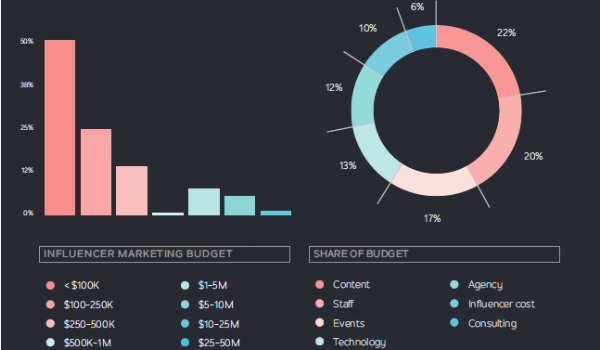

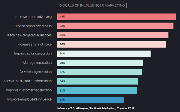
 What does “influencer marketing” mean to you? Are you thinking of celebrities posting product photos to Instagram? Or having a famous YouTuber run a contest for a meet and greet at an event? Why not send products to bloggers in the hopes that they’ll review and say nice things? Surely that’s not all enterprise marketers think of when it comes to the possible outcomes with influencer relationships. The promise of brands collaborating or outright paying influential individuals to create content that lifts the brand’s credibility and reach to sell more products is something that companies of all sizes have been hot on - especially in the past 12 months. With a groundswell of interest, there are many divergent interpretations of what influencer marketing really means. With so many different opinions, best practices and even definitions, we set out with influencer marketing platform
 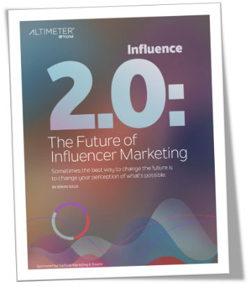 The result is something I am very proud to be a part of. Influence 2.0: The Future of Influencer Marketing. In this elegantly designed report, Brian outlines an argument for evolving influencer marketing to influencer relations, or Influence 2.0. Brands need to evolve their view of influencer marketing from short term transactional engagements to a more strategic and holistic view that emphasizes long term influencer relationships. He also discusses the digital transformation of marketing, the importance for brands to humanize their marketing and the role of influence with customer experience. Of course he covers the role content within influencer marketing and makes predictions for the future too. While this report is geared towards senior enterprise level marketers, it also includes 10 steps for setting the foundation of an Influence 2.0 approach that I think practitioners at companies of all sizes will find valuable. The icing on the cake to this report are the quotes and case studies from marketing influencers, many of which are clients of our agency, that I respect greatly including: