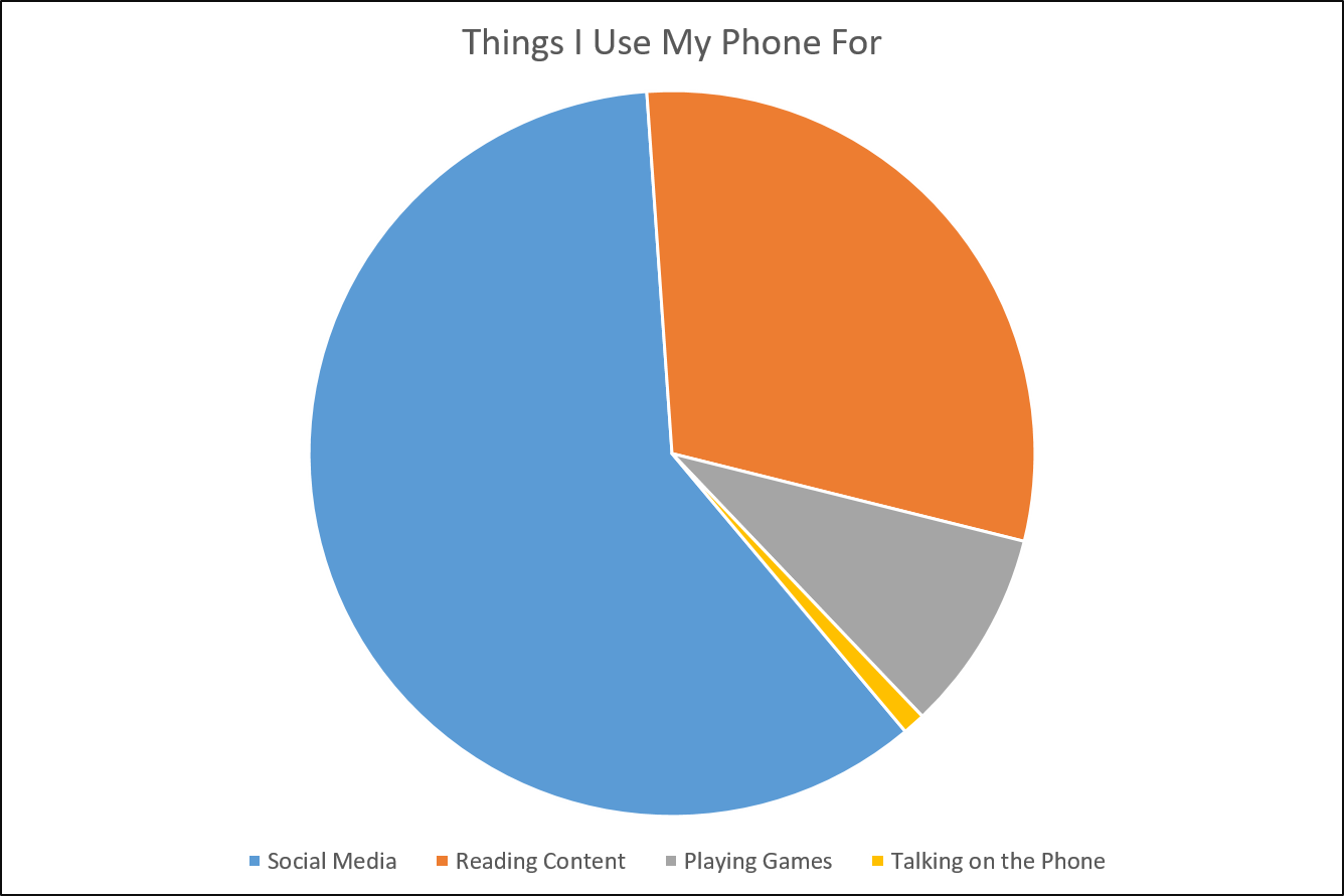
How often do you use your smartphone as a phone? Personally, I think of it as more for avoiding human interaction than facilitating it:

These days my desktop and home laptop are gathering dust; I can do it all on my phone. The only reason we still call them “phones” is “personal computation device” sounds too nerdy.
All of which to say: Mobile is the current and next frontier for content marketing. Reports show that 65% of digital media time is now spent on a mobile device. Not only that, all digital growth is now coming from mobile usage—expect to see desktop traffic stagnate or reduce while mobile traffic continues to grow.
So how do you create content that works as well on a 5-inch screen as it does on a 17-inch monitor? Here are a few guidelines.
Focus on the Center of the Screen
Eye tracking studies show that most people read in an f-shaped pattern on a monitor:
![]()
The top left corner tends to get most of the attention, and the outer right edge gets virtually none. This pattern has informed web design for the past decade. We tend to put the most important information on the top and down the left side.
On mobile devices, however, there usually isn’t space for f-optimized content. Eye tracking on mobile shows people focus their attention on the center of the screen and on images.
For content marketers, that means:
- Shorten your headline to fit on one line
- Adjust your header image to put the headline front and center
- Add a short blurb under the headline summarizing the content
If your reader has to swipe, shrink or tap to see your content, they’re likely to hit the back button instead.
Ditch the Interstitials
On a desktop, those pop-up windows with special offers do get results without affecting readership overly much. When the little “Do You Want 1100 Secrets about Cheese?” window shows up, it’s easy to click “Yes! Cheese Me up!” or “No Thanks, I’m Lactose Intolerant” and go about your day.
On a mobile device, though, interstitials tend to lead to bounces. It affects the user experience enough that Google will start penalizing pop-ups in January.
Instead of a pop-up, you can embed your offer in the content as an organic call to action based on what they’re already reading. That way you can enhance the content with a next-step offer, instead of obscuring it.
Think Scroll, Not Click
From an advertising perspective, content consumption on desktop is a page at a time. Each new page load is an opportunity to display new ads. So it makes sense to add page breaks into content; the more, the better.
For mobile users, though, each page break means tapping a tiny “Next” button with pinpoint precision. It ranges from a mild nuisance to a bounce-worthy offense.
It’s better to put your content all on one page and let readers scroll vertically through it. Swiping up to scroll is easier than playing target practice with a Next button.
If you can organize content in a slideshow, so users can swipe left and right to see it, that works, too. But the best option is still one long page.
Optimize Your Text
Mobile users tend to read content in shorter sessions than laptop or desktop users. Not only that, the time reading is likely to be full of distractions. Your content may be competing with another screen, another person, or a sidewalk full of pedestrian obstacles.
It’s best to make your writing efficient, skimmable, and resumable if interrupted. Here’s how:
- Keep sentence structure simple. You don’t have to write like Tarzan, but avoid paragraph-long sentences.
- Use headers to highlight your main points.
- Break paragraphs every 2-3 sentences. If the text fills the whole screen with no white space, your reader can get lost.
- Avoid vague paragraph starters like “Because of this [referring to the previous paragraph], we should…” Your reader will have to scroll backward, and may opt out. Keep the momentum moving forward, repeating points if you need to.
Reach Out and Touch Someone
Increasingly, your audience is going to be searching for and consuming content on mobile devices. To avoid search engine penalties and high bounce rates alike, make sure your content is optimized for mobile. Put the most pertinent information front-and-center, get rid of interruptions, and make the text easy to consume. With the right content, you might persuade your reader to use their phone as a phone—to give your business a call.
What else does the future hold for content marketing? Check out our expert predictions for 2017.
![]() Gain a competitive advantage by subscribing to the
Gain a competitive advantage by subscribing to the
TopRank® Online Marketing Newsletter.
© Online Marketing Blog - TopRank®, 2016. | Content Marketing: 4 Ways to Make Sure Your Mobile Content Connects | http://www.toprankblog.com
The post Content Marketing: 4 Ways to Make Sure Your Mobile Content Connects appeared first on Online Marketing Blog - TopRank®.
No comments:
Post a Comment